This site serves as an archive of LAArtTheory blog posts from 2011 to 2013 and is not currently active. Thanks for reading!
Reaction:1019 at Beacon Arts Building
First came the pop-up, and now the pop-up within a pop-up! This past weekend the curating duo Matthew Gardocki and Catlin Moore of Mark Moore Gallery mounted their latest pop-up exhibition as 5790projects. Catlin and Matthew have been working and curating together for quite some time and have a true eye for finding some fabulous connections and correlations between the works of often seemingly-unrelated artists. The last 5790projects pop up was devoted entirely to performative works so this exhibition seemed much more staid in comparison but for its relatively quiet nature, the works spoke strongly next to one another. The exhibition, ele:mental, was made up entirely of fairly technical and technically proficient wall work but the textural elements were vibrant and vibrational as they existed together in the intimate space.
On the occasion of the opening of ele:mental by 5790projects, the artists of Beacon Arts Building also opened their studios to the public and invited artists from BAB’s sister building, 1019 West Art Studios, to fill in the empty studios. I had the great pleasure of organizing this pop-up within a pop-up that we called reaction:1019, and was very lucky that some of my favorite 1019-ers were willing to submit work. Some of the submitted works were pre-existing and some were made as site-specific installations for the BAB studios. This brings up, yet again, a major distinction that must be made more explicit as the word “curate” becomes more and more a part of our daily lexicon, there is an important difference between curating an exhibition and organizing a group of artists. With the exhibition for ZERO DOWN as well as this group show as reaction:1019, I submitted a call to a large group of artists who are similar only in that they work within the same building and then did my best to group the submitted works by content and theme as seemed appropriate. When functioning as a curator, there is a larger organizational or theoretical construct that determines the work, artists, and imagery selected to speak in the context of one another. That said, it is really great fun and quite a challenge to try to situate a rather random gathering of works and attempt to create a conversation between them!
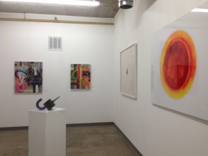
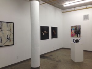
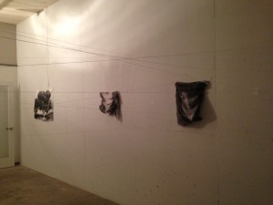
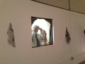
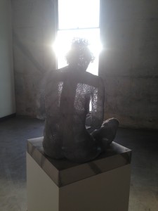
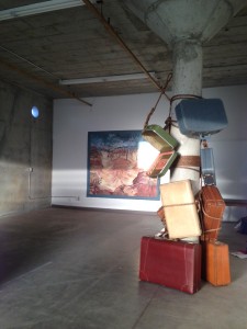
Here are some images of the pop-up within a pop-up that was reaction:1019
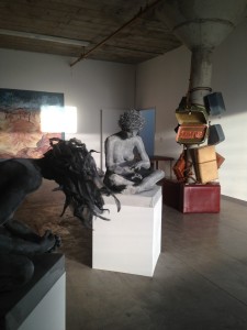
In the foreground, sculptures by Melanie Newcombe, site specific installation by Susan Amorde, and in the background, Tangled Trees by Jeanne Dunn.
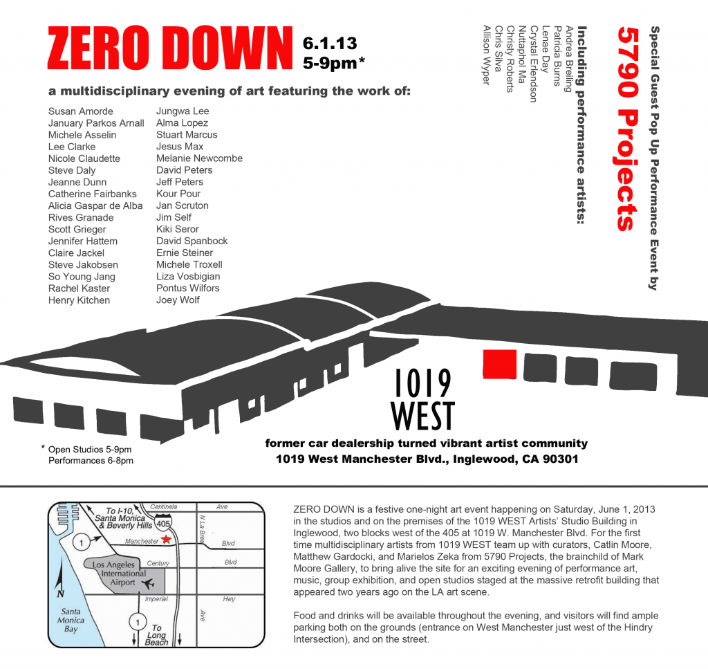
ZERO DOWN; A one-night multimedia art event
ZERO DOWN is a festive one-night art event happening on Saturday, June 1, 2013 in the studios and on the premises of the 1019WEST Artists Studio Building in Inglewood. For the first time, multidisciplinary artists from 1019WEST team up with curators, Catlin Moore, Marielos Zeka, and Matthew Gardocki from 5790 Projects, to bring alive the site for an exciting evening of performance art, music, group exhibition, and open studios staged at the massive retrofit building that appeared two years ago on the LA art scene.
More than 30 artists’ studios at 1019WEST will be open to the public from 5-9pm, while 5790 Projects’ eight invited performance artists will be intervening throughout the site from 6-8pm. Food and drinks will be available throughout the evening, and visitors will find ample parking both on the grounds (entrance on West Manchester just west of the Hindry intersection), and on the street. Several art models from The Gallery Girls will act as hostesses for the evening.
“It’s always interesting visiting with the artists here because everybody is unique and there’s no single style. Plus, there’s an LA sort of logic to having art studios in an old automobile dealership,” said Scott Grieger, tenant artist and Professor of Art at Otis College of Art and Design.
Participating artists from 1019WEST are:
Susan Amorde, January Parkos Arnall, Michele Asselin, Lee Clarke, Nicole Claudette, Steve Daly, Jeanne Dunn, Catherine Fairbanks, Alicia Gaspar de Alba, Rives Granade, Scott Grieger, Jennifer Hattem, Claire Jackel, Steve Jakobsen, So Young Jang, Rachel Kaster, Henry Kitchen, JungHwa Lee, Alma Lopez, Stuart Marcus, Jesus Max, Melanie Newcombe, David Peters, Jeff Peters, Kour Pour, Jan Scruton, Jim Self, Kiki Seror, David Spanbock, Ernie Steiner, Michele Troxell, Liza Vosbigian, Pontus Wilfors, Joey Wolf.
Participating artists from 5790 Projects are: Patricia Burns, Andrea Breiling, Lenae Day, Crystal Erlendson, Nuttaphol Ma, Christy Roberts, Chris Silva, and Allison Wyper.
Coordinating Social Media and Museum Audience Engagement
Despite social media’s natural fit within the art museum context, very few museums are using social media tools to truly advance their mission. Most museums have a separate PR or marketing segment of their organization and far too often this segment is not integrated into the curatorial aspects of the museum. Social media tools provide a platform to grow and expand the curatorial efforts of the organization, not just to advertising what is going on in the brick and mortar space.
Royal BC Museum instituted Ask a Curator Day during which they made their curators available to ask questions via Twitter
In an overview of openness and its importance to the museum community, Kelly, Ellis, and Gardler pointed out that increasingly museums are giving up their strict control over content and collections in favor of a more open policy, allowing the audience to in part curate their own experience of the museum collection. Erika Dicker of the Powerhouse Museum in Australia, in an overview of Australian curators, found that while most curators still see their roles as intrinsically connected to the object-ness of the collection, an increasing number are finding social media to be an integral part of their evolving job description. Dicker states, “The majority of participants defined themselves using terms such as ‘researchers’, ‘knowledge brokers’, ‘communicators’, ‘facilitators’ and most commonly ‘interpreters’. One clear message in the response to this question is that a curator’s role is still strongly connected to objects, collections and material culture.” Looking at this terminology, “knowledge,” “communication,” “facilitation,” and “interpretation,” it strikes me that these practices are all very much a part of today’s web reality. The social aspect of new media is only one part of the tools provided by these platforms and museum administrators would be wise to encourage curators to fully utilize and expand upon these opportunities.
One organization on the cusp of fully integrating social media into their mission and platform is the Wexner Center for the Arts at The Ohio State University. In her master’s degree thesis, Mini Gu provides a case study that covers the social media experimentation within this cutting-edge contemporary art museum. Academic museums (museums connected to colleges and universities) are more likely to be small, centrally organized, and generally embracing of technological advances because of their youthful audience. Because of these qualities there are several university museums at the forefront of social media utilization and curatorially incorporated audience engagement. The Wexner Center is a lovely example of new media integration and gives us a springboard to talk about both what works and what could be expanded in terms of the social museum experience.
According to Gu, the Wexner’s mission is to be, “the international laboratory for the exploration and advancement of contemporary art.” One of the first and clearest ways that Wexner differentiates itself from many other museums with its virtual presence is that it has established a separate and complementary mission statement for its web site, “We’re constantly enhancing our web presence to make your virtual forays a vibrant complement to your in-person visits. I hope you find both experiences rewarding, and invite you to return often to the Wex domain.” Gu outlines the tools the Wexner uses to achieve its goal, most under the direction of the Director of Marketing and Communications. These tools include three Facebook pages, one for the institution, one for the film/performance programs, and one for the bookstore, a Twitter feed, a Flickr site for event photographs, Four Square check in, and on their own site, a blog, a podcast, and live-str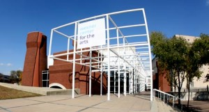 eaming of events. The goal for the museum’s social media is that it 1) brings people to the center, 2) increases awareness of activity and engages the audience, and 3) builds community.
To gauge and ensure that it meets its goals, the Wexner has developed several performance metrics and social policies. It encourages curatorial staff to be involved, creating “behind the scenes” stories, it maintains a policy document for the staff that defines “employee responsibility in terms of social media,” and the Social Media Coordinator uses Google Analytics and other sites to assess quantitative measurements. The Facebook page seems to have moderate traffic flow and could be enhanced greatly. Currently the Wexner is mostly providing information through this portal, and could be incorporating many of the photographs from its Flickr page in order to start a more dynamic and conversational network expansion. The Twitter account is again mostly a portal for the Wexner to announce events but more actively encourages audience-generated conversation. The account could speak to users more conversationally and encourage mentions by re-tweeting from followers as well as engaging in discussions outside of their specific marketing goals and event PR. The Wexner’s blog and podcast are really the jewel in their social media utilization and should be supported more clearly by their presence on external sites such as FB and Twitter. Blogs and podcasts that highlight collectors, donors, curatorial staff, behind-the-scenes interviews and access, and artist interviews, are interesting and unique and could generate publicity and interaction were they more widely shared by the museum itself.
Within the museum space itself the Wexner seems not to fully utilize the potential of social media. This is a common mistake as most museums see their virtual presence as an extension or reflection of the physical space rather than seeing these two elements as integrated and conducive to overlap. The museum does seem to be on the right track, however, as Gu described the Wexner’s Director of Marketing and Communication as saying, “He compared the current status of social media in the organization to the sidecar of a motorcycle. He believed that: ‘In the future, social media [will] have to be the motorcycle itself.’” This is indicative of a growing interest among museum communication scholars toward bringing social media and on-the-ground audience engagement into alignment.
Dicker quotes Nina Simon of Museum 2.0 as encouraging museums to envelop the social media platform back into the museum. This is an important point about integration rather than externalization of the museum’s mission with social media. This important step, however, requires the physical institution to support the structures of new media, namely allow for and encourage the use of personal technology within the museum space. More of a challenge than it seems at first, this acceptance must function on all levels of the museum from security to curatorial, education, to the highest levels of administration. Many of use were raised in an eyes-only era of museum experience, and the physical spaces of museums are still inclined toward an expectation of passive viewership. Even as organizations provide audio tours that function from your telephone and QR codes to access further information on wall-based works, they simultaneous assure, by enforcing strict no-photography policies, that these tools will not be used to their potential. In an age when our phone is our camera, our online portal, our written communication center, notebook, and our social media access point, the process of restricting its usage in some ways while encouraging others within the museum space is confusing and limiting for audience engagement. Embrace new media potentials or don’t, but museums today are sending mixed messages as they cling to their staid institutional pasts while superficially incorporating new media elements.
Dicker, Erika. “The Impact of Blogs and Other Social Media on the Life of a Curator.” Archives & Museum Informatics. Museums and the Web, 13 Apr. 2010. Web. 19 Mar. 2013. <//www.museumsandtheweb.com/mw2010/papers/dicker/dicker.html>.
Gu, Mimi. “Engaging Museum Visitors Through Social Media: Multiple Case Studies of Social Media Implementation in Museums.” Thesis. The Ohio State University, 2012. Print.
Simon, Nina. “Museum 2.0: How Much Time Does Web 2.0 Take?” Museum 2.0. Museum 2.0, 10 Apr. 2008. Web. 19 Mar. 2013. <//museumtwo.blogspot.com/2008/04/how-much-time-does-web-20-take.html>.
Social Media in the Museum: An Analysis of the Brooklyn Museum Case Study
Recently I began a new position on the Board of Directors for Inglewood Cultural Arts, a grass-roots arts non-profit serving the city of Inglewood and surrounding areas. As I embark on re-tooling their social media presence, I have been exploring in depth the use of social media by non-profit arts organizations and have encountered some interesting case studies. Of particular interest to me was a fairly critical 2011 case study of the Brooklyn Museum‘s social media presence by Richard MacManus. Obviously, social platforms have changed greatly over the last two years, as have general organizational best practices having to do with integrating social platforms into museum programming, so I was inspired to analyze the study and look into the Brooklyn Museum’s changing social outreach. MacManus’ original case study on the Brooklyn Museum can be found here.
Richard MacManus’ Social Media Case Study on the Brooklyn Museum appeared in September of 2011 and was particularly critical of the museum’s too-broad use of platforms. In the year and a half following the report, the Brooklyn Museum has made some key changes in their use of social media, mostly for the better and, it seems, partially in response to the remarks made in this case study.
In 2011, MacManus found that the Brooklyn Museum had established profiles on at least six separate social media channels, in addition to their blog and web site. Shelley Bernstein, the CTO and representative for the museum claimed “social media is about what the visitor can bring to the equation… we want to engage with our community.” MacManus found, however, that despite the active use of several channels, the lackluster utilization of others was detering the museum from their focus of visitor engagement.
The Museum was using six separate social media platforms semi-regularly, Facebook, Twitter, YouTube, Flickr, Tumblr, and Posse although they also maintained a profile on MySpace but it had been dormant for over a year. MacManus analyzed the activity on each site and made several observations about the use and usefulness of the platforms toward the Museum’s mission. Facebook was being used to give information to the public and to answer questions, but the museum’s policy of allowing visitors to openly post was leading to an abundance of spam on their wall. The site was functioning as a basic Q & A arena rather than truly engaging audience members to advance the mission. Twitter was being used sporadically despite the supposed “gaggle of staffers” who were posting. YouTube provided educational content but was also seldom used by the museum. Flickr and the blog were both functioning to provide “behind-the-scenes at the Brooklyn Museum” posts but were somewhat infrequent and often more archive focused than engaging. The museum found that the greatest feedback and most active viewer engagement was happening on Posse, where users could comment freely on their experience at the museum.
MacManus concluded that the museum was casting their social net too wide and suggested that they focus on one or two channels and engage more frequently. Underscoring the difficulty many museum professionals were having in addressing the use of social media to engage audiences, MacManus cited the Tate Museum’s differentiation between the use of social media for product promotion versus the goal of non-profits to “promote, educate, enthuse, inspire, and generally deliver a public service, no one yet seems to have the guru-stylings to fit the peculiar problems of the cultural organization.” The Tate, however, provides a great counter-example to the Brooklyn Museum in its pioneering utilization of new media tools. In fact, in their programming plan for 2013-15 they make a point to assert, “Digital is increasingly a dimension of everything.” Tate has partnered with Flickr to distinguish local photographs and bring their works into the physical galleries of the museum. Another successful program is the “Digital Dialogues” platform wherein museum visitors can record questions for exhibiting artists and the artists will then answer the questions and post their replies on the web site. These are truly innovative ways to engage audiences, harnessing the immediacy of viewership and coupling it with the extensive reach provided by digital tools.
Check out this pdf SlideShare from the Tate about their Digital & New Media programming
Or view it on the web here
Brooklyn Museum was making several mistakes in their social media strategy. The museum was certainly spreading itself too thin, with not enough content to engage audiences on these multiple platforms. Additionally, the museum was too dependent on users to generate content, in their focus on allowing visitors to use the space freely rather than on reaching out to users themselves, they relied too much on organic audience enthusiasm. The use of twitter and other platforms by multiple museum employees rather than having a dedicated social media marketing team, meant that the voice was impersonal and without continuity. Finally, the museums was not asking questions or bringing social media into the physical space of the museum, it was operating its net presence as if it were a wholly outside experience rather than integrating viewership into the social network.
Today, the museum has only whittled down its social media presence to five platforms but there is more continuity and overlap and their use of the tools is more mission-focused. On Facebook, Brooklyn Museum has grown to 77,959 likes and as a page now rather than a user, it has stifled the spammers who were clogging the wall. Unfortunately, this platform is still mostly being used to GIVE information rather than ASK for comments and is often one-sided. The most successful posts in terms of shares and comments are those wherein they ask for input and thoughts from the audience. On Twitter, they have established a following of 395,702, but I think expanding the users they follow would help to develop a greater dialogue with their audience. As it is, almost all of the posts receive no replies, only occasional re-tweets. The museum has a strong lecture program that they advertise on these platforms and discuss after-the-face, but they might consider asking followers to post questions through social media that they could then integrate into the lectures themselves.
YouTube, Flickr, and the blog are being used in much the same way they were at the time of this case study, however with the museum’s recent exhibition, “GO,” YouTube became central to both the concept and execution of the show. This exhibition was a “community curated open studio project” wherein hundreds of Brooklyn-based artists opened their studios to the public over two days and the public then voted on who would be included in the exhibition. The open studios were coupled with interviews posted to YouTube with most of the artists. The Blog’s content is also very good although not necessarily engaging, it does offer behind-the-scenes information that allows viewers a glimpse at the museum’s inner workings and personality. The blog could be made better by timing posts adequately rather than having multiple posts within one day and no posts for several weeks.
On the whole, the Brooklyn Museum has begun to take great advantage of social media platforms, but they could continue to expand the depth and integration of their interactions.
Meditations on Retrospectives: Llyn Foulkes at the Hammer Museum
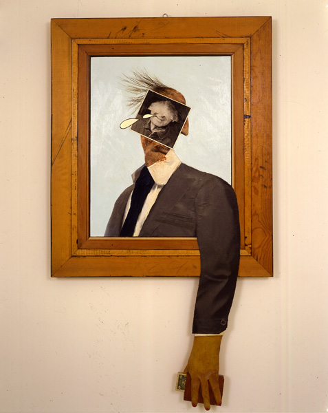 The Hammer Museum’s Llyn Foulkes retrospective has been up now for about a week but because of its magnitude I felt compelled to visit a few times before I could write about it here. You can read some great articles about the show itself and Foulkes’ intriguing background various places on the internet as well as on the museum’s web site, so here I would like to take the opportunity to discuss the curatorial process in mid-career or living-artist museum retrospectives. Now that I have had the chance to spend a bit more time with this comprehensive exhibition, and was able to walk through with the curator, Ali Subotnick, I am even more convinced that IF a museum is going to do a living retrospective, this show is a great model. Please, though, heed the IF in that last sentence, because when poorly curated, retrospectives can and do actually diminish the perception of an artist and their work!
Punctuating the entrance didactic with the Foulkes quote, “Music is my joy, painting is my angst,” prepares viewers to engage one of the enduring elements through the artist’s 50-some year career. The exhibition is mostly chronological, beginning with cartoons and some early art-school paintings, and divided into five large main galleries that represented roughly the five decades of his active work. Walking into the show, one is greeted by a wall-sized photograph of Foulkes’ 1960s home complete with taxidermied animals, road signs, shards of wood, and various other objects that seed his work. This entrance immediately places the viewer in contact with the man, the artist, we are greeted by his presence rather than his work, allowed to percolate in his early mind-set with cartoons and drawings, to see his humor and youthful passion for art. Subotnick’s choice to begin this way sets the tone for the show, bringing it together from the outset rather than forcing the viewer to make sense of it only in the end. The curator gives us a road map, not oppressively and not through dry text, but by allowing us into the life of the artist, to step in his shoes, and look at his work in three ways at once, through historical perspective, through the artist’s individual personality, and through our own eyes.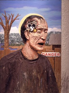
There are some different theories about the role of retrospectives for contemporary artists. Christopher Knight, in his LA Times review of the Foulkes exhibition, said, “Foulkes’ esteem has waxed and waned over the decades, and the job of a retrospective like this is to secure the artist’s reputation by making the strongest case. It needs editing by at least one-third.” Back in 1994, David Rimanelli wrote in an article for Frieze that covered a Mike Kelley living retrospective, “just what does it mean to have a ‘mid-career’ retrospective–isn’t that like jumping the gun on art history, pretending to write it when, at best, one can try to take the temperature of the zeitgeist, at worst slavishly serve the immediate interests of the art market.?” The curator does have to present a case for the artist, but that is the same for every exhibition, the WHY are we looking at this is just as important as WHAT we are viewing. On the other hand, though, a retrospective that makes the case by excluding a huge amount of the artist’s work, the unpopular or ineffectual series, the experiments and failures, can’t do justice to that aim either. Case in point is the Cindy Sherman retrospective organized by the Museum of Modern Art in New York last year. This exhibition, sponsored by major collectors of Sherman’s work, skips the artists’ lesser known and unpopular works, focusing on what collectors and the public prefer, and, thereby, never letting us see the artist through the work.
 In the case of Cindy Sherman this is an easy mistake to make given the seeming presence of the artist within her work. Curator Eva Respini didn’t allow herself to access Sherman the artist because she was so captivated by Sherman the muse. Llyn Foulkes’ use of himself as element of the work is only a part of the picture, the Foulkes retrospective allows space for the artist himself to emerge as a personality. Subotnick encourages the man and the image in her presentation, whereas Respini’s sole focus is on the image and because the image is of the creator, she neglects the personality behind the work. Roberta Smith pointed out in a review for the NY Times of the Sherman show, that “less familiar groups of Sherman-free works, all from the ’90s, are skipped altogether: her mask series, horror and Surrealism series, Civil War series and the gnarly, broken-doll series in which she suddenly reverted to working small and in black and white while going through a rough divorce. In an interview in the catalog she notes that collectors prefer works in which she appears; it is unfortunate that the Modern reinforces this view… Finally, the show plays down Ms. Sherman’s astounding artistic precociousness by including too few of her earliest works and then sprinkling them among other efforts in the first and last galleries.” Sadly, although I have been a Cindy Sherman fan from the first image of hers that I beheld, I left this exhibition at MoMA wondering if I was wrong in my assessment of her great artistry. The curators made Sherman look like a one-trick pony.
Rimanelli, in his Kelley article for Frieze, tells us of a friend’s reaction to the retrospective, the friend said, “it almost makes me think Mike Kelley isn’t as great an artist as I’d always though he was.” Rimanelli replied, “it is interesting that a fan of Kelley’s work would immediately take such a vehement exception to the Whitney’s installation on purely formal grounds.” Any knowledgeable art enthusiast will see Sherman’s artistry despite the exhibition, but what is more concerning is the reaction of the lay viewer, and the missed opportunity to portray this artist as a whole creative personality. Art is not a quirk or gimmick, real artists try and fail, they experiment and make missteps as well as giant leaps. Art without experimentation is decoration. The retrospective curator’s job is not just to increase the value of sale-able works, but to give us a view into the creative process, to the great known works, yes, but also to how artists get to those breakthroughs.
This artistic and historical mission is difficult to maintain when so much is on the line for museums presenting retrospectives of widely collected artists. This is especially so given the prominence of collectors on museum boards and the intermingling of gallerists and museum directors/curators. A response to the U.S. Copyright Office’s notice of inquiry regarding art resale royalty rights by Kimerly Rorschach asserts, “retrospectives of a living artist’s work can be instrumental in establishing his or her reputation and standing in the art world. All these can translate into significant economic benefits to an artist in the sale of the artist’s work.” Of course, this extends also to greatly increased benefits to early collectors of the artist’s work as well, so long as the retrospective makes the case for those popular works. In the case of the Tate’s 2012 retrospective of Damien Hirst, The Economist points out, “of the 67 pieces borrowed for the show, only three have come from public institutions, the rest are on loan from dealers and a range of private collectors… Luckily for them, works that have been anointed by the Tate, command more credibility and a premium upon resale.” Retrospectives often depend on the generosity of collectors, and collectors call for the presentation of their works in the best possible light.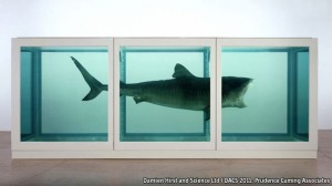
About Llyn Foulkes, Holly Myers wrote in the LA Times, “what I like about Llyn is that on the verge of success, he almost always says the wrong thing, makes the wrong move. He is somebody who perennially zigs when he should zag, which I think, in some ways, has kept his art very pure.” Without seeing the foibles, without acknowledging the missteps and sidesteps, we could never get a picture of this artist’s creative process, of his pure and unadulterated talent and obsession. It is this full picture that makes the case of why exactly he should be in the annals of art history rather than a side-note like so many who create great works with no real substance. It is unfortunately the MoMA did not give Sherman the same treatment, allowing her process and personality to be a part of the exhibition, luckily, I’m sure this retrospective will not be Sherman’s last.
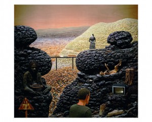 You can see Llyn Foulkes at the Hammer Museum through May 19th. For events and information around the exhibition, check their web site. //hammer.ucla.edu
There’s no there there… or is there? Art Los Angeles Contemporary at the Barker Hanger
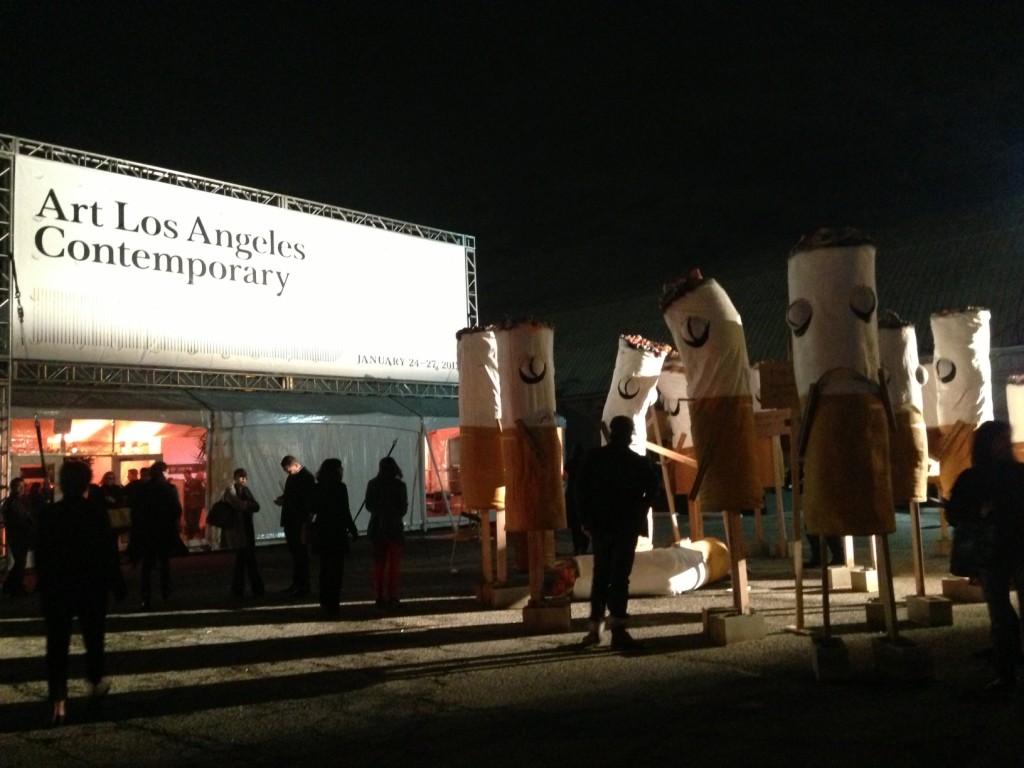
Jon Pylypchuk’s “It’s not you, it’s me, I will always love you dear” met visitors to Art Los Angeles Contemporary, January 24-27, 2013
The art community in Los Angeles had a real treat this past weekend between openings, free museum admission, and the general events and socializing that mark the presence of art fairs with both Art Los Angeles Contemporary and the LA Art Show opening to large crowds last week. This year’s contemporary fair again occupied the nicely-sized and manageable Barker Hanger in Santa Monica. The venue allowed organizers to collaborate with local venues and complement the market-based focus of the booths with lectures, films, performances, and installations that appealed to a wider art audience.
Walking up to the Barker hanger entrance, visitors were greeted by John Pylypchuk’s “cartoonish political rally” of anthropomorphized cigarette butts holding somewhat nonsensical signs referencing everything from pop culture to relationship taboos. Pylypchuk’s ability to bring his internal make-believe worlds in the viewer’s reality is unique and very successful in this case. With the art world’s general mix of apathy, resigned acceptance, and flustered attempts to combat, the market-driven nature of art fairs and their prevalence, these caricatures seem to teasingly mock the conflicted viewers and attendees.
In general galleries at ALAC were fairly bold with their choices, in many cases choosing just one or two emerging artists to take over their booths rather than present a “best face” exhibition of highlights from their best known. I was struck by the large number of European galleries and general dearth of Asian and Latin American galleries that rounded out the showing so nicely last year. Many works unfortunately fell short, presenting the kind of aggressive and poorly constructed pieces that inspire criticism of the art world for its “emperor’s new clothes” fallacies (a mouse peeing into a skull atop a mountain of patagonia vests… really?). On the other hand, however, I was pleased to see some real gems that imbued the space with humor, gravitas, pleasure, and delightful confusion, despite the always-challenging viewing conditions of the art fair.
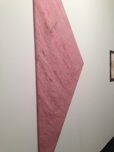
Chicago gallery Monique Meloche, turned over their entire booth to young artist Dan Gunn. Despite the fact that Gunn only recently emerged from his MFA at the School of the Art Institute of Chicago, his work is well developed with broad appeal. The draped works are by far my favorite with their architecturally monumental forms contrasted by the look of fabric so connected to the feminine and maternal. The organic nature of the wood along with Gunn’s soft flare for color, using it for emotional resonance without overwhelming the materials, further invites the viewer to a palpable relationship with the pieces.
Thomas Duncan Gallery also took a chance, handing over their booth to another young artist, Sean Kennedy. Kennedy’s work has explored media and meaning, searching for the lines of symbiotic meaning. Past work has included hanging clear acrylic with precisely arranged objects high above the gallery floor, like a live version of a camera-less photograph. Kennedy’s new work, unfortunately, just doesn’t hold the space, there isn’t enough visual or contextual interest to engage viewers for longer than a quick glance. In this case, to quote Gertrude Stein’s famous line, there’s just no there there…
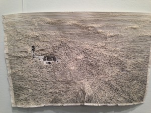
Another delightful surprise was the work of Cathryn Boch at Claudine Papillon, Paris. Boch really excavates the nature of material, utilizing paper and thread predominantly and envisages the lines and trajectories of memories and interconnections of place. The works themselves physically are lovely things aching to be touched but also, like Orpheus’ bride, Eurydice, they ring of their own fragility and propensity to slip away at the faintest breath upon their surface.
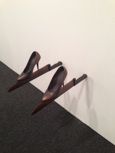
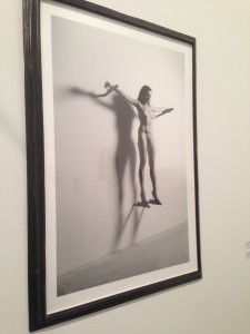
Claudine Papillon had another win with the work of Javier Perez, “en el filo,” loosely translated to “on the edge.” Consisting of four bronze blades protruding from the wall, the bottom two topped by precariously balanced bronze high-heeled shoes, the installation is positioned beside a starkly gorgeous black and white photograph showing the installation in use by a surprisingly unconcerned nude woman. The organic nature of the woman’s body and its photographic reality is contrasted with the harsh blades and dark, surrealistic fairy tale Perez has envisioned.
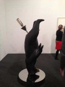
David Kordansky stuck with a safe choice showing (again) Richard Jackson’s beer bear from 2010. Jackson’s (better work) often immersive spaces infused with shock and humor, as welcome as they would be to the non-buying audience, are just not suitable for the more staid art fair crowd. These bears must have been big sellers, however, because the gallery has shown them at ALAC for three years in a row.
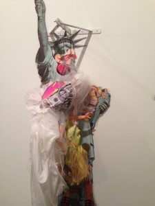
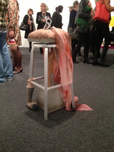
Both Agathe Snow at Hussenot and Lizzie Fitch at New Gallery, really stumbled in this context. Snow claims to “cartoon archetypes” but her presented work, “Senator’s Many Ladies (for John Edwards)” just seems a silly joke without any craft or forethought. Works so dependent on the contextualization of the museum or gallery just don’t translate within the art fair. Similarly, Fitch’s stool piece, a bit haphazard and unfocused anyway, couldn’t hold up to the chaos of New Gallery’s booth and crowds. Fitch is at her best when she keeps her materials simple, or when her chaos contrasts the staid presence of the white cube, but within the raucous fair, her craft gets lost.
Fabric seemed to be a common element throughout the fair with artists from the previously mentioned Dan Gunn and Lizzie Fitch, to Night Gallery’s Alika Cooper’s painterly version and Clara Montoya’s gorgeous tapestries at Marta Cervera, but among the most successful was Liam Everett at Altman Siegel. Jonathan Griffin in Frieze described Everett’s bare yet intricate works as “battered survivors of previous punishments” and they truly do bear the battle wounds of their creation, but the works are also peaceful meditations on process, respite from an otherwise elaborate and chaotic viewing experience.
It’s rainy, let’s go see some art!
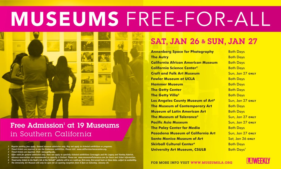
Look out Los Angeles, if you weren’t planning to indulge in some art viewership this weekend, this may change your mind! Not only have hundreds of international galleries descended on us with the LA Art Show at the Convention Center, and Art Los Angeles Contemporary at Barker Hanger, but also at least 19 area museums are offering free admission this weekend.
Events to check out associated with Art LA Contemporary include:
- Jim Shaw’s The Hole and The Whole presented by MOCAtv at ALAC today (Thursday, January 24th) and MOCAtv will again be a spotlight for ALAC on Saturday from 5-7pm with “Feast of Burden”
- “It’s not you, it’s me, I will always love you dear” by Jon Pylypchuk will premier as a large-scale installation at ALAC’s entrance.
- Also a part of ALAC, director Jodi Willie will present “The Source Family” with original members of the family in attendance at 4pm on Friday, January 25th at Santa Monica Airport’s Ruskin Theater
- The Ruskin Theater will host another ALAC event, Saturday, January 26th at 2pm with Ry Rocklen’s “Trophy Modern” followed by Scott Benze’s “W.W.A.R./Die Dritte Generation” at 4pm
- Machine Project is presenting “Paris At Your Home” at 5pm on Saturday in their space on North Alvarado as part of the Ceci N’Est Pas series
- Night Gallery will also be holding their Grand Opening Saturday night from 8-10pm in their new space at 2276 E. 16th St.
- Closing the ALAC fair, the Los Angeles Free Music Society will give a talk presented by East of Borneo at 2pm Sunday, January 27th.
Free museums:
Art in Person: the limits of what we can see virtually… Laura Owens at 356 Mission
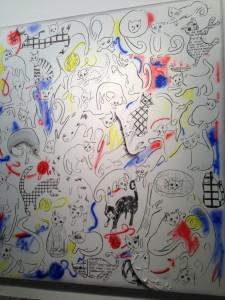
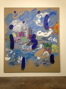
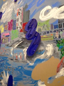
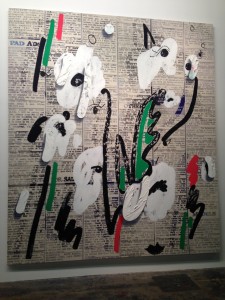
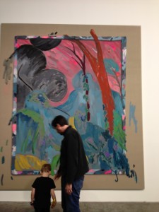
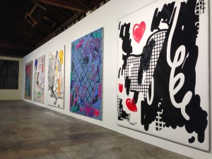
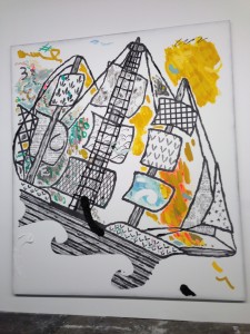
The latest addition to LA’s downtown art scene is actually a New York transplant, 356 Mission. The westward expansion of Gavin Brown’s Enterprise opened officially tonight with the premier of 12 enormous paintings by gallery regular, Laura Owens. Owens has occupied the industrial warehouse for months, creating works that could only have been fabricated in such an expansive environment. During my first visit to the warehouse this past summer, Owens’ project was still in its infancy, as was the space. Tonight I was glad to see that the central area had been segmented from the entry by a large white wall and that the interior of the gallery portion of the building, while still enormous, was considerably less chaotic, capped by two long white walls stretching from end to end of the space. These two walls were covered with Owens’ work, just 12 paintings that seem somehow to fill the room with light and color. The vibrancy, depth, and texture of the work, as well as the scale, made the space seem pleasantly enveloping rather than overwhelming. In fact, I have struggled (briefly) about whether to even put these images from the evening up on the web because they, in some ways, take poignancy away from the original paintings. In these simple pictures, there is just no way to convey the lovely experience of stepping into this grand space and having the luxury of seeing art works within their place of genesis, of appropriate scaling and the flexibility to view both minute details and overarching themes within a collection of images.
Eh, I’m going to do it anyway. That is a testament to how fabulous I think these images are, they stand up to different media, but… brave the downtown traffic and GO see them in person!
//356mission.com/
//356mission.tumblr.com/
“Where’s the Art?”: On Looking at the Venice Beach Biennial
This weekend I had the opportunity to be involved with a unique event in the Los Angeles art community, the Venice Beach Biennial. Presented by the Hammer Museum as part of the first Los Angeles Biennial, Made in L.A., the VBB was a playfully irreverent and light-hearted take on the “real” Venice Biennale in Italy. Curator Ali Subotnick chose a roster of 80-some artists she thought could hack the conditions of this weekend-long festival that tested not only creative bounds but also physical stamina. Subotnick imposed one simple constraint on the invited artists, they had to play by the rules of the Venice Beach Boardwalk, a grueling world where vendors arrive at 5am to vie for the best spots and sit in glaring sun and driving winds to sell their wares to an often-critical and apathetic audience. Needless to say, this was a new world for these nationally and internationally recognized artists, but it also turned out to be quite a culture shock for the collectors who ventured west-ward in the hopes of meeting and buying works from their personal darlings.
I personally had several roles in the event (hence my relative silence on this blog for the last month) but the most enlightening was my experience standing in the info booth at Windward, directly behind Barbara Kruger’s contribution, directly in front of works by Jason Meadows, Liz Craft, Alex Israel, Pentti Monkkonen, John Geary, Mark Grotjahn, Nery Gabriel Lemus and directly next to Kenyatta Hinkle’s performative installation. Surrounded by art, the first question 80% of info booth visitors asked was, “Where’s the art?”.
The entire experience was, of course, a little overwhelming for visitors who faced traffic, parking scarcity and heavy foot traffic to even find the starting line. These patrons of the arts often searched through a boardwalk filled with art, crafts, and, yes, some crap, searching for their idea of “fine art” and were often unable to see it directly in front of their eyes. Work given the blessing of fine art museums worldwide, when presented in the context of the boardwalk craft fair, seemed indistinguishable to people supposedly versed in the field. This says something important about three separate aspects of the art world: connoisseurship, curation, and contemporary art work in general.
Art today, and specifically works created intentionally to fit into this
particular environment of a packed boardwalk filled with working artists and tourists, is meant to blend, to say something about our experience from the inside rather than the distanced gaze of the onlooker that so often characterizes art output historically. Many contemporary artists are interested in the subversive, the unexpected, the interventions into established memes of experience and convention, but perhaps they overestimate the general population’s relative environmental attention. Without traditional didactics and other viewership cues, interventions went completely unnoticed even among an audience with an expectation toward viewership and familiarity with the artists.
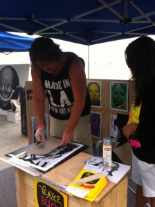
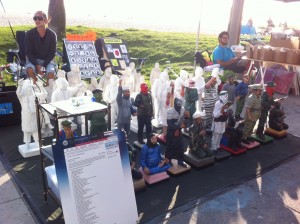
Burton Machen customizing prints from his Urban Evolution series in a vending space on the boardwalk
Perhaps our sense of connoisseurship is overrated? Without a price tag attached, it seems many collectors of contemporary art don’t have any idea the value or worth of an artist’s output. I wondered throughout the weekend why it bothered people so much not to know which art was brought in to the boardwalk by the Hammer and which art was created by veteran boardwalk artists. Perhaps collectors, having a stake in their “eye” for art, were wary of putting that expertise on the line by unintentionally enjoying a work of little value. Is it so frightening to look for the sake of looking, to buy for enjoyment rather than investment? Perhaps I sound a little skeptical here, and I certainly count myself among those who value the curatorial filter in my viewing experience, but I think it is also a valuable learning experience and life experience just to focus my eye upon the world and see what I find.
Thirdly I think the Biennial highlighted the value of curators in the museum context. Just as so many museums are consolidating and downsizing their curatorial departments (hello MOCA Los Angeles), the Hammer has given us a perfect example of what curators do and why their interventions are so essential to viewer experience. The word is overused today from pinterest to music shows to food, “curated” is used to modify a variety of groupings made by the uninitiated to suggest anything that is selected rather than the academic rigor and archival function of the trained museum curator. Collectors are not curators just as a reader who dog-ears the pages of a decorating magazine is not a designer. Curators like Ali Subotnick spend years training their eye through historical research and personal interactions with artists and art works, to be able to see the gems in the crowd and put them together in a cohesive unit which is then cared for and presented in a way that allows for dialogue between and within space and works. An environment like that of the VBB allows us to truly appreciate an exhibition like Made in LA, where similar artists are given the full and traditional curatorial treatment.

Nathan Danilowicz created a new sculpture for each day of the Biennial in a vending space on the boardwalk, the last was offered for sale at $2,500 (installation included).
Overall it seems the reception for VBB was positive among outside art enthusiasts, artists, and the Venice community. I hope more patrons of the arts put themselves in these positions, there are a lot of great artists out there who haven’t yet been given the blessing of major institutions and we shouldn’t shy away from enjoying and even purchasing and displaying their works. At the same time, let’s all remember and take a moment to appreciate the environment and experience we are treated to in the museum!
